Writings |
|||
A brief post on Half Life 2's Visual Direction |
 |
||
|
Tuesday, February 27, 2007
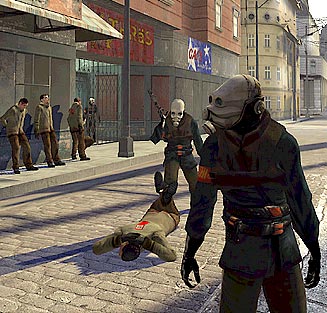
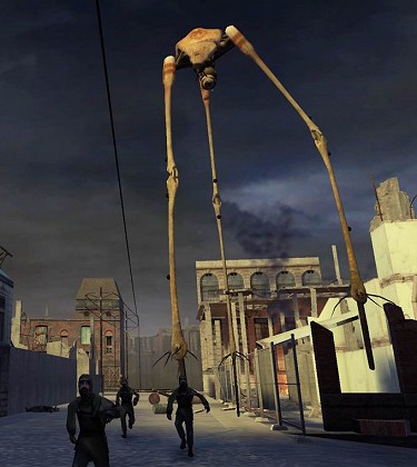
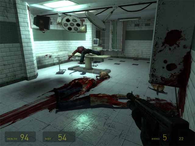
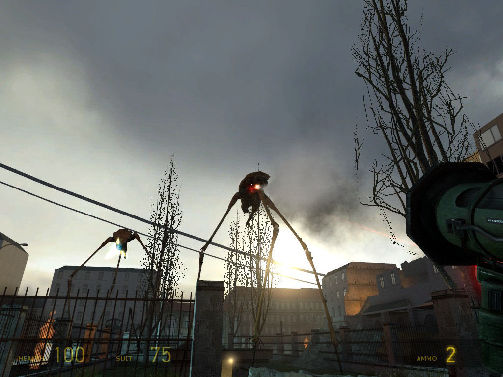
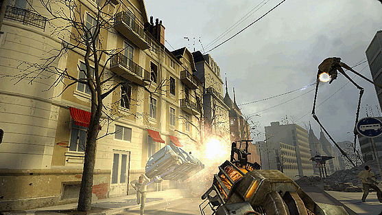
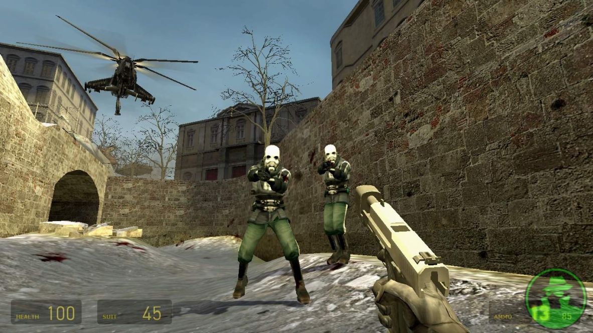
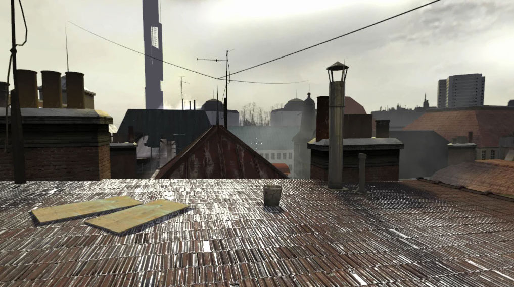
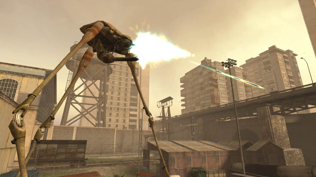
I still don't understand why people think HL2's graphics are/were amazing. Has anyone even played Far Cry, FEAR, COD2 etc? HL2's textures are painfully low res. - Cyanara The thing that people forget is that HL2's art direction was amazing. I can't think of another title in recent memory that had a higher level of visual cohesiveness on a reasonable polybudget. For example, darkness consistently equals safety throughout the game, whereas any point you're exposed to sunlight is a location shrouded in danger. This is consistent both internally and externally. No-one, to my knowledge, has followed this color styling, yet it is an effective technique at making the player feel like an unwelcome outcast. You can see how minimalist this tree really is. They only gave it just enough branches to cover the illusion, but not so many that it holds up to actual inspection. Another shot of said tree, from a more common angle. By not wasting any polys, they really can afford to put more on-screen. Heck, look at leaves. Artificially close, they are a big smear. But from the distance you normally see them, they can stick thousands of these things on screen, and they look beautiful. Love the look of brick? Notice how in this shot they've burned the bump maps and damage maps and everything into the same texture? The increases the repetition in texture, but if you vary your geometry sufficiently the player will never notice. All they'll notice is a lot more is going on on-screen than they're used to. This technique looks terrible for big-open walls, but Half Life studiosly avoids big open walls within proximity of the player. They even used a distinct pallete of blacks, muted browns, and light blues. This was far before anyone else was using anything but super-saturated primary colors. Ignoring any technical accomplishments, this is an achievement of strong visual composition and consistent, solid art direction. - Chris 8:42 PM [+] |